Imagine this situation. You carefully prepare your marriage biodata. You choose a good design, write a thoughtful “About Me,” add your photo, and export it as a PDF. Then you send it on WhatsApp.
But when the other family opens it on their phone, the text looks tiny. They have to zoom in and out again and again. The layout breaks. Some lines get cut. Within seconds, they lose interest.
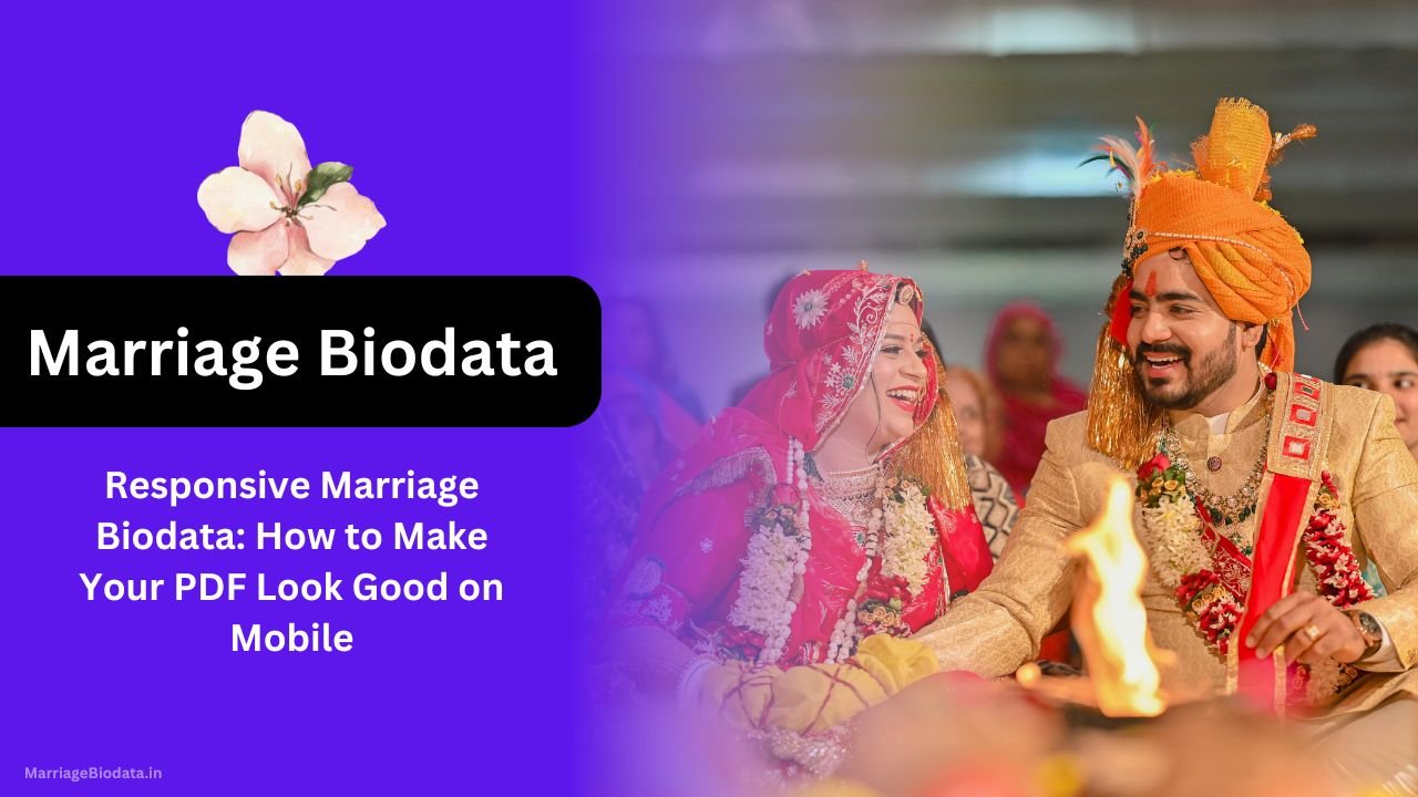
This is why Responsive Marriage Biodata: How to Make Your PDF Look Good on Mobile is no longer optional — it is essential.
Today, most matrimonial biodata files are opened on mobile phones, not desktops. If your biodata for marriage is not mobile-friendly, you may be losing opportunities without even realizing it.
What Is a Marriage Biodata?
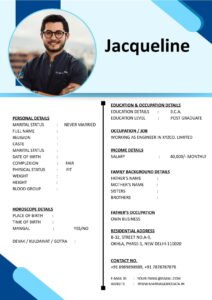
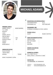
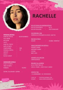
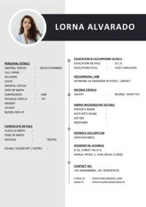
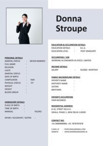
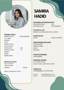
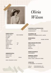
A marriage biodata is a structured document that introduces a bride or groom to potential matches and their families. It usually includes:
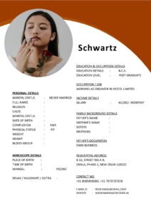

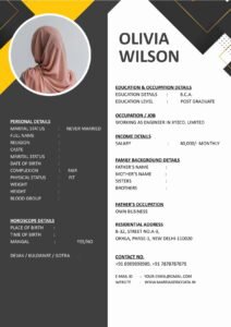
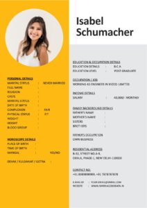
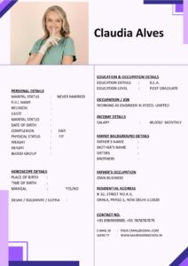
- Basic personal details
- Education and profession
- Family background
- Hobbies and interests
- Partner expectations
It is sometimes called a matrimonial biodata or even a marriage CV. Unlike a job resume, it focuses more on personality, values, and compatibility.
However, even the best content can lose impact if the marriage biodata format does not display properly on mobile devices.
Why Mobile-Friendly Biodata Is So Important
Let’s be practical.
Most biodata sharing happens through:
- Matrimonial apps
- Telegram
In almost all cases, the first view happens on a smartphone.
If your PDF is not responsive:
- Text may appear too small
- Margins may get cropped
- Photos may look distorted
- Readers may feel frustrated
First impressions matter. A clean and readable biodata template creates professionalism and seriousness.
What Does “Responsive Marriage Biodata” Mean?
A responsive marriage biodata is one that:
- Looks clean on both mobile and desktop
- Has readable font size without zooming too much
- Uses proper spacing
- Maintains layout balance in PDF format
It is not about fancy graphics. It is about clarity and comfort.
Step-by-Step Guide: How to Make Your Marriage Biodata PDF Mobile-Friendly
Step 1: Choose the Right Page Size
Most people use A4 size. That is fine. But avoid very wide layouts or landscape orientation unless necessary.
Portrait orientation works better for mobile viewing.
Step 2: Use Simple Fonts
Choose easy-to-read fonts like:
- Arial
- Calibri
- Times New Roman
Avoid decorative fonts. They look stylish on desktop but difficult on small screens.
Font size should ideally be:
- 11–12 for body text
- 14–16 for headings
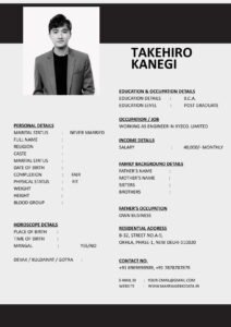
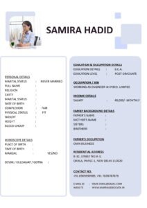
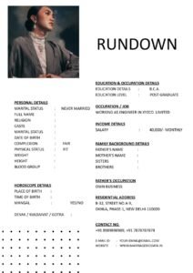
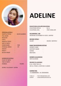
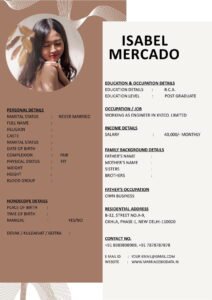
Step 3: Avoid Two-Column Layouts
Two-column designs often look good on laptops but feel cramped on mobile.
Instead, use a single-column marriage biodata format where information flows vertically.
Step 4: Keep Margins Balanced
Too much margin wastes space. Too little makes text feel crowded.
Keep margins moderate so content fills the page neatly.
Step 5: Compress Image Size Properly
Large photos increase PDF size and slow down loading.
Use a clear but optimized image. Avoid oversized files.
Step 6: Test Before Sending
This step is very important.
- Export your biodata as PDF.
- Send it to your own WhatsApp.
- Open it on your phone.
- Scroll naturally without zooming.
If reading feels smooth, you are ready to share.
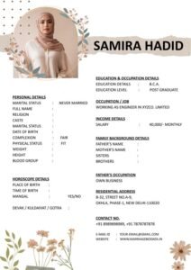
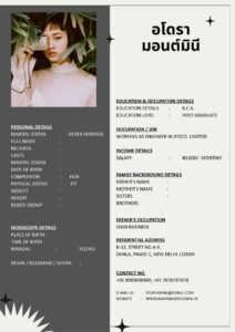
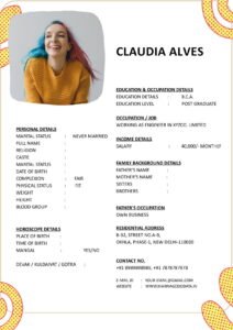
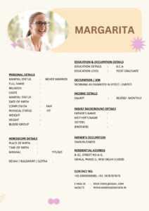
Real-Life Example
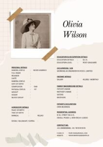
Priyanka created a beautifully designed marriage CV using a stylish template with two columns and light gray text. On her laptop, it looked elegant.
However, when shared with families, many people had trouble reading it on mobile. The text appeared tiny, and some elders could not zoom comfortably.
She later switched to a simple, clean, single-column biodata template with darker text and slightly larger fonts.
The difference was immediate. Families responded more positively because the document felt easy and professional.
Common Mistakes to Avoid
- Using very small font size
- Adding too many design elements
- Using light-colored text on white background
- Creating landscape layout
- Uploading heavy PDF files (above 5–6 MB)
- Skipping mobile testing before sending
Your matrimonial biodata should feel comfortable to read, not stylish but stressful.
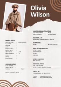
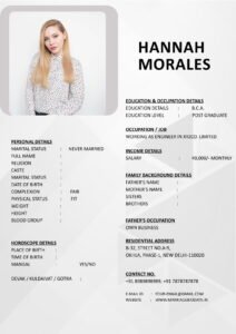
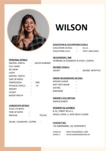
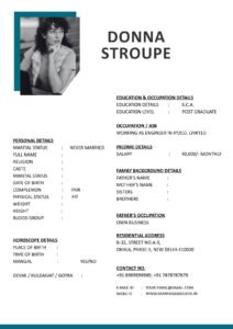
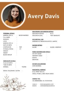
Best Structure for Mobile-Friendly Biodata
A simple and responsive structure looks like this:
- Full Name (Bold and clear)
- Basic Details (Age, Height, Location)
- Education & Profession
- Family Details
- Hobbies & Interests
- Partner Expectations
- Contact Information
Keep sections separated with spacing, not heavy design blocks.
Pro Tips for a Responsive Marriage Biodata
- Keep the entire document within 1–2 pages.
- Use clear section headings.
- Avoid excessive bold text.
- Maintain consistent alignment.
- Save the final version in high-quality but optimized PDF format.
- Name the file clearly (e.g., Rahul_Marriage_Biodata.pdf).
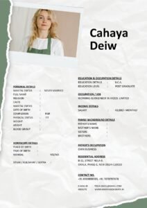
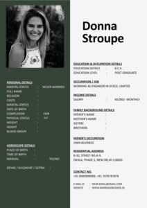
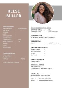
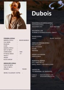
If you are unsure about layout and spacing, you can download professionally designed and mobile-friendly biodata templates from https://marriagebiodata.in/. These templates are structured for clarity and easy sharing.
Why Simple Design Wins Over Fancy Design
In matrimonial discussions, clarity is more important than creativity.
Families care about:
- Values
- Education
- Career
- Family background
They do not need graphic design experiments.
A neat biodata for marriage signals maturity and seriousness.
Conclusion
Creating a responsive biodata is no longer just a design choice — it is a smart strategy. In today’s mobile-first world, your Responsive Marriage Biodata: How to Make Your PDF Look Good on Mobile can directly influence first impressions.
A clean marriage biodata format, readable fonts, balanced spacing, and proper testing ensure that your profile is viewed comfortably on any device.
Remember, presentation supports personality. When your marriage CV is easy to read, your values and strengths shine more clearly.
Keep it simple. Keep it readable. And always test before sending.
Frequently Asked Questions (FAQ)
1. What is the best font size for marriage biodata PDF?
Body text should be 11–12 points, and headings 14–16 points for better mobile readability.
2. Should I use a two-column marriage biodata format?
It is better to avoid two columns if most viewing will happen on mobile devices.
3. What is the ideal PDF size for sharing on WhatsApp?
Keep the file under 2–5 MB for smooth sharing and downloading.
4. How many pages should a matrimonial biodata have?
1–2 pages are ideal. Longer documents may feel overwhelming.
5. Where can I find mobile-friendly biodata templates?
You can explore clean and easy-to-edit biodata templates on trusted matrimonial-focused platforms that specialize in structured marriage biodata formats.