When people think about a marriage biodata, they usually focus on the content — education, career, family background, and expectations. But design matters more than most people realize.
The way your biodata looks can influence how seriously it is taken. Too plain, and it may feel dull. Too flashy, and it may look unprofessional.
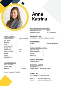
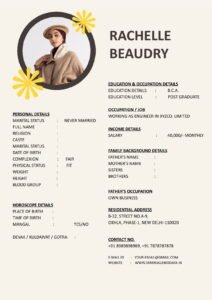
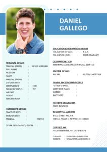
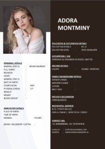
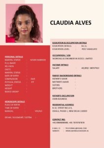
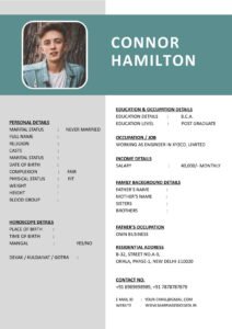
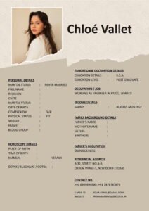
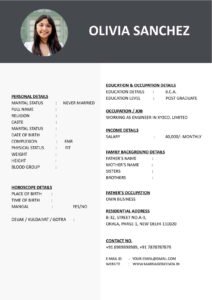
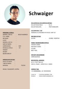
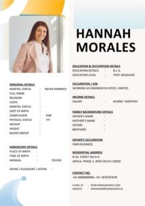
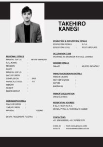
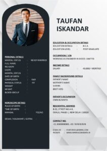
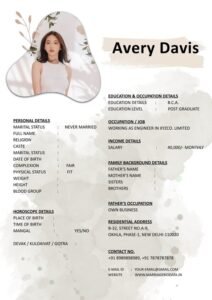
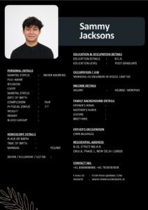
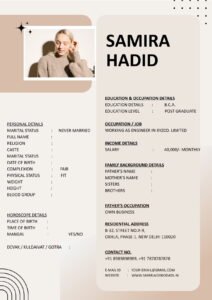
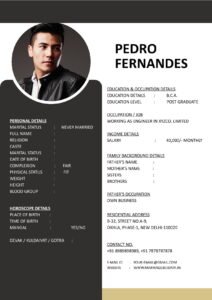
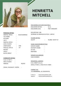
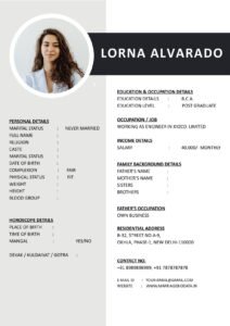
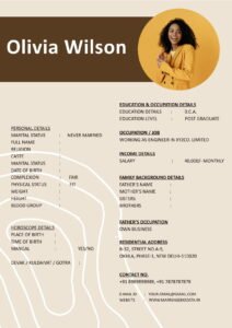
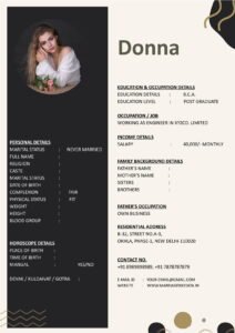
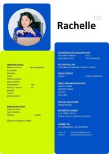
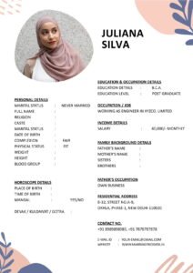
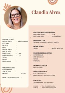
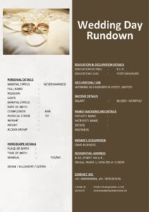
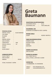
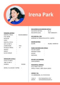
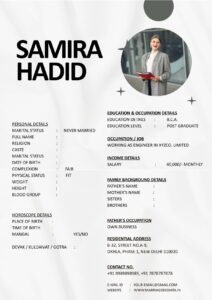
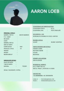
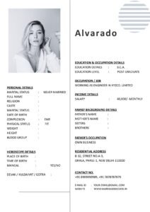
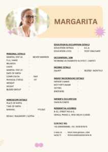
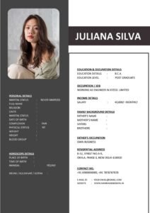
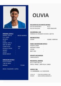
![]()
This guide on Smart Use of Color, Fonts and Icons in Marriage Biodata Design will help you create a profile that looks elegant, modern, and easy to read — without going overboard.
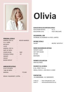
What Is a Marriage Biodata?
A marriage biodata is a structured document prepared for matrimonial purposes. It includes personal details, education, profession, family background, lifestyle, and partner expectations.
You can think of it as a marriage CV for life partnership. A well-designed matrimonial biodata not only shares information but also creates a visual impression.
That is why design elements like color, fonts, and icons must be used carefully.
Why Design Matters in Marriage Biodata
Families often scan a biodata quickly before reading it in detail.
Good design helps:
- Improve readability
- Create a positive first impression
- Highlight important sections
- Make the document look professional
A clean marriage biodata format reflects maturity and clarity.
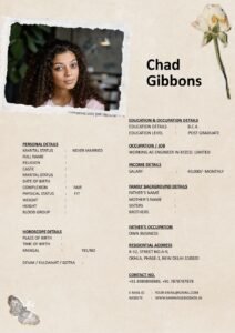
Smart Use of Color in Marriage Biodata
1. Choose Soft and Elegant Colors
Neutral shades work best:
- Light blue
- Soft grey
- Pastel peach
- Subtle lavender
- Classic beige
These colors look calm and professional.
2. Avoid Bright and Neon Shades
Very bright red, neon green, or heavy dark backgrounds can make reading difficult.
Remember, your biodata for marriage should look respectful and balanced.
3. Use Color for Headings Only
Instead of coloring the entire page, use color only for:
- Section headings
- Small borders
- Subtle highlights
This keeps the marriage biodata format clean.
Choosing the Right Fonts
1. Stick to Professional Fonts
Safe font choices include:
- Calibri
- Arial
- Times New Roman
- Garamond
These fonts are easy to read and widely accepted.
2. Avoid Decorative Fonts
Fancy or handwritten fonts may look attractive but can reduce readability.
Your matrimonial biodata should feel professional, not like a greeting card.
3. Maintain Font Consistency
Use:
- One font for headings
- One font for body text
Avoid mixing too many styles.
4. Use Proper Font Size
- Headings: Slightly larger (14–16)
- Body text: Comfortable size (11–12)
Balanced spacing improves readability.
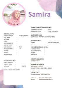
Using Icons Smartly in Marriage Biodata
1. Use Minimal Icons
Small icons next to headings like:
- Phone icon for contact details
- Graduation cap for education
- Briefcase for profession
Can improve visual appeal.
2. Avoid Excessive Graphics
Too many icons make the biodata look cluttered.
3. Keep Icons Simple
Use flat and simple icons — not colorful or cartoon-style graphics.
Your marriage CV should remain elegant.
Step-by-Step Guide to Design Your Biodata Professionally
Step 1: Start With a Clean Layout
Choose a structured biodata template with clear headings.
Step 2: Select a Soft Color Theme
Use one subtle color consistently.
Step 3: Choose Two Fonts Only
One for headings, one for content.
Step 4: Add Minimal Icons
Only where necessary.
Step 5: Maintain White Space
Do not overcrowd the page. Space improves readability.
If you prefer ready-made designs, you can explore clean and customizable templates at https://marriagebiodata.in/ and adjust colors and fonts easily.
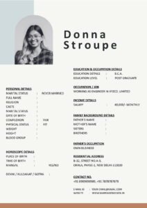
Real-Life Example
Ritika initially created a very colorful biodata with multiple fonts and bright borders.
Although it looked creative, families found it difficult to read.
She later redesigned it using:
- Soft pastel theme
- Single professional font
- Minimal icons
- Clear section headings
The new matrimonial biodata looked clean and elegant — and responses improved.
Common Mistakes to Avoid
- Using more than three colors
- Mixing multiple decorative fonts
- Overloading with graphics
- Using dark backgrounds with light text
- Ignoring spacing and margins
Design should support content, not distract from it.
Pro Tips for Elegant Marriage Biodata Design
1. Think Professional
Your biodata for marriage is a formal document.
2. Less Is More
Simplicity creates class.
3. Maintain Consistency
Use the same color theme throughout.
4. Keep It Printable
Ensure it looks good in both digital and printed formats.
5. Use a Structured Biodata Template
A professionally designed biodata template helps maintain balance. You can download elegant and editable formats from https://marriagebiodata.in/.
Why Design Reflects Personality
The way you design your marriage biodata format reflects your:
- Attention to detail
- Organizational skills
- Sense of balance
- Maturity
Clean design creates trust.
Conclusion
Smart use of color, fonts and icons in marriage biodata design can elevate your profile without making it look flashy.
Choose soft colors. Use professional fonts. Add minimal icons. Maintain spacing and structure.
Your matrimonial biodata should look elegant, clear, and easy to read.
Remember, good design supports your story — it does not overpower it.
Frequently Asked Questions (FAQs)
1. How many colors should I use in marriage biodata?
Stick to one or two soft colors for a clean look.
2. Are decorative fonts recommended?
No, use professional and readable fonts only.
3. Can I use icons in biodata?
Yes, but keep them minimal and simple.
4. Should biodata be colorful or plain?
Soft and subtle color themes work best.
5. Where can I find professionally designed biodata templates?
You can explore clean and customizable biodata templates at https://marriagebiodata.in/.